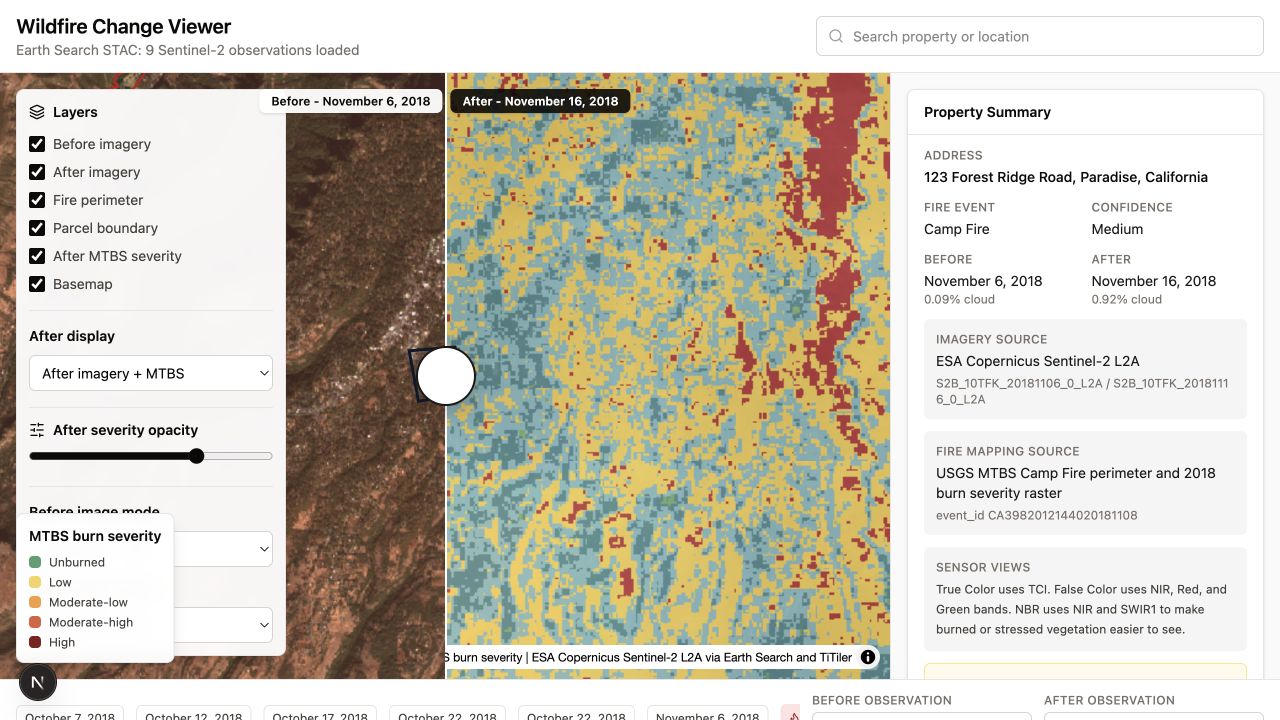
Wildfire Change Viewer showing satellite imagery before and after the Camp Fire, with layer controls, a property summary, and a timeline
The prototype brings comparison, source context, and the event timeline into one view.

Projects

Reading Wildfire History Through Satellite Observations

A small side project for comparing satellite observations before and after a wildfire.

PrototypeWildfire · Earth observation · STAC · Interfaces

Starting Point

A wildfire is not a single image. It is an event with a before, an after, a geographic extent, and consequences that vary from one place to another.

Satellite archives contain this history, but finding comparable observations and interpreting the differences still requires knowledge of sensors, bands, dates, cloud cover, and data sources.

What I Wanted to Try

How might someone inspect the history of a wildfire around a place they care about without first learning the structure of an Earth observation archive?

I wanted to keep the source imagery visible while making before-and-after comparison the main interaction.

What I Built

I built a small Wildfire Change Viewer around the 2018 Camp Fire near Paradise, California. It places two satellite observations side by side and uses a draggable boundary to move between them.

The timeline anchors the observations around the fire date. Layer controls allow the same place to be viewed as true color, false color, Normalized Burn Ratio (NBR), or with the USGS Monitoring Trends in Burn Severity (MTBS) layer.

The current data path combines:

  • Sentinel-2 L2A observations found through Element84 Earth Search STAC
  • raster tiles rendered from cloud-optimized imagery through TiTiler
  • the Camp Fire perimeter and 2018 burn severity data from USGS MTBS
  • MapLibre for synchronized maps and layer interaction
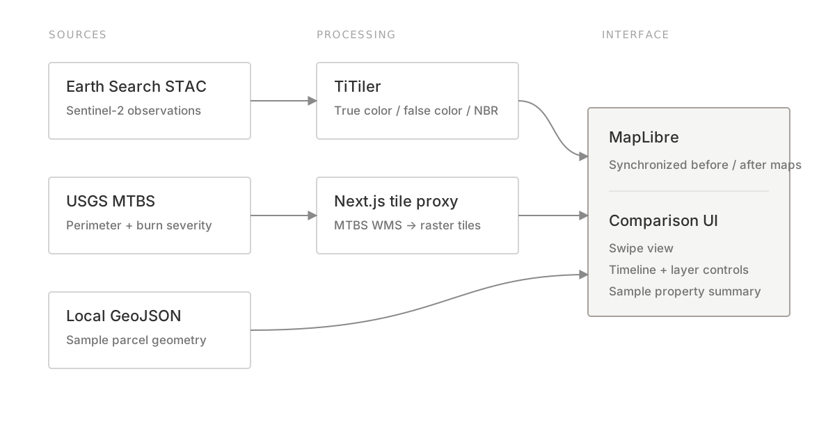
Data pipeline from Earth Search STAC, USGS MTBS, and local GeoJSON through TiTiler and a Next.js proxy into the MapLibre comparison interface
A simplified view of how the current prototype assembles imagery, fire data, and sample property context.

What I Tried

I tried treating time and change as the main controls rather than presenting a single map with more layers.

In the view below, the left side retains the pre-fire true-color observation while the right side shows the post-fire NBR view with MTBS burn severity. The boundary can be moved across the same geographic position.
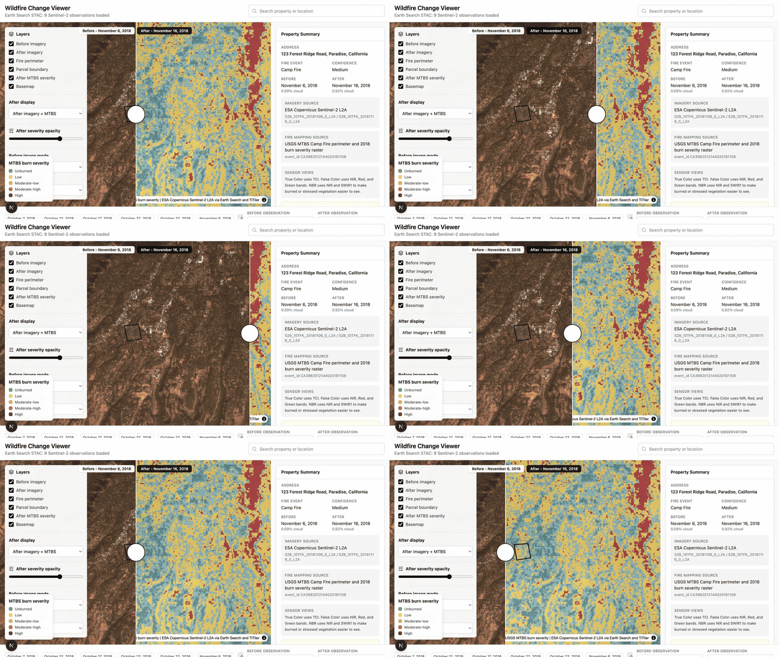
The comparison boundary being dragged between pre-fire true-color satellite imagery and a post-fire NBR view around Paradise, California
Dragging the boundary compares a familiar visual image with a representation designed to expose vegetation change.

This makes it possible to move between visual evidence and an interpreted severity layer without losing geographic alignment.

What I Noticed

The swipe interaction made visible change easier to inspect, and the timeline made the choice of observations explicit. But those improvements did not resolve the more difficult part of the experience: knowing what a technical representation means in relation to a question about a place.

True color, NBR, dNBR, and MTBS severity are not simply alternative visual styles. Each is a different step of interpretation, with different assumptions and different kinds of evidence. Presenting them together as equivalent layers places the work of translating between those representations on the user.

The problem may not be how to visualize more Earth observation data, but how to progressively translate technical observations into representations appropriate to the user's question. Someone asking whether a particular place changed may need to move from a recognizable image, to an observed spectral change, to an interpreted severity class, and finally to the limits of what that evidence can support.

This shifted my interest from improving the map interface itself toward exploring the translation layer between Earth observation data and human questions. The interface could reveal each representation when it becomes useful, explain why it was introduced, and preserve a path back to the source observation rather than presenting every analytical layer at once.

What It Does Not Do Yet

This is a hobby prototype, not an operational damage assessment tool.

The Sentinel-2 observations are retrieved through a live STAC search, and the Camp Fire perimeter and burn severity layer use USGS MTBS data. The parcel boundary, parcel-level affected area, dNBR statistics, and assessment narrative are currently illustrative sample values. The narrative is rule-based; no AI model is used in the current version.

The prototype also focuses on one fire and fixed date windows. It does not yet account for the full uncertainty involved in selecting comparable observations or attributing surface change.

What I Would Try Next

  • Should the experience begin with a property, a fire event, or a detected change?
  • How should the interface explain why particular before and after observations were selected?
  • Which representation helps a non-specialist understand change without hiding uncertainty?
  • Can the system move from showing imagery to answering a question about a specific place?
  • What information is needed before satellite-observed change can support a real decision?